Popular movie poster cliches (16 images)
You’ve probably noticed these popular movie poster cliches before, but never noticed that you noticed. I know that was the case for me. This probably falls into the category of ‘if it ain’t broke, don’t fix it’ – but when they’re all presented together like this it just seems a bit lazy.
As someone who loves movie covers and posters, it’s an interesting idea. I couldn’t help but thinking of these when I was at the Redbox tonight, trying to decide which movie I wanted. My eyes were certainly drawn to movies whose covers followed these principles.
Miraculously, none of them specifically involve breasts.
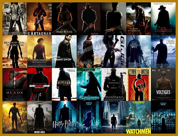
1. The loner, viewed from behind
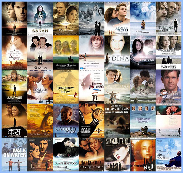
2. Big heads above tiny people on a beach
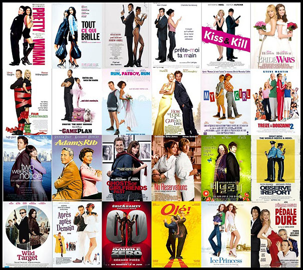
3. Back to back, viewed from the side
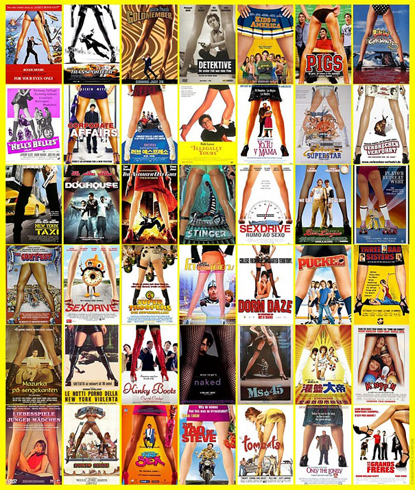
4. Between the legs shot
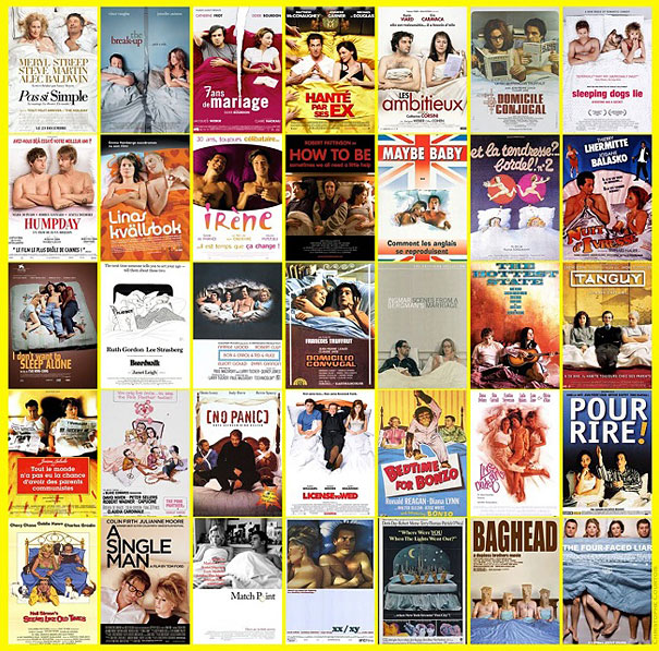
5. In bed, viewed from above
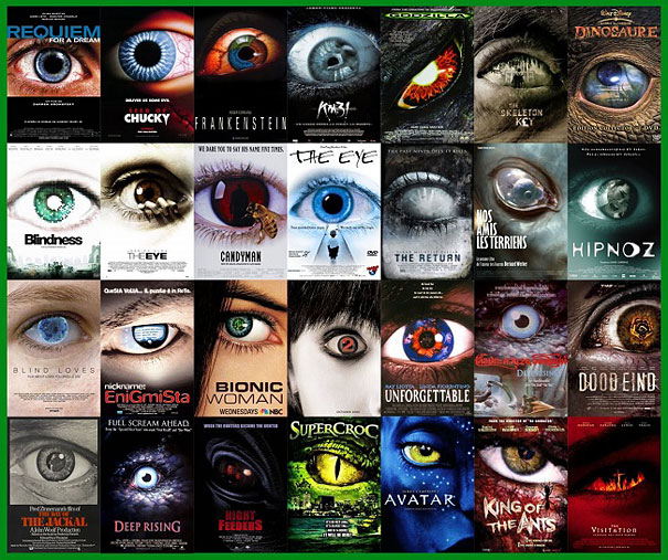
6. Giant eye
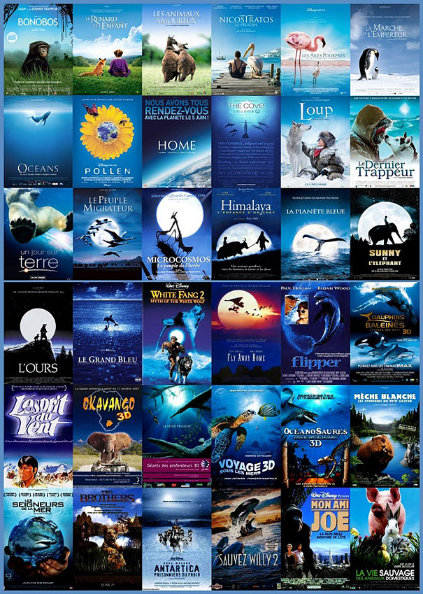
7. Feeling a bit blue
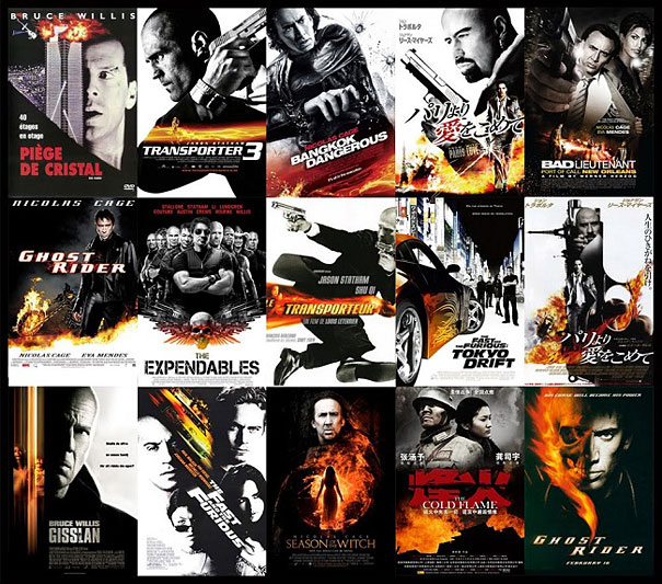
8. Black and white + fire
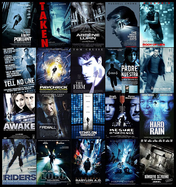
9. Running in the street, tilted, tinted blue
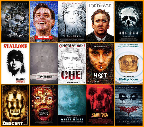
10. Collage faces
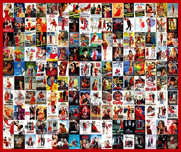
11. Lady in red
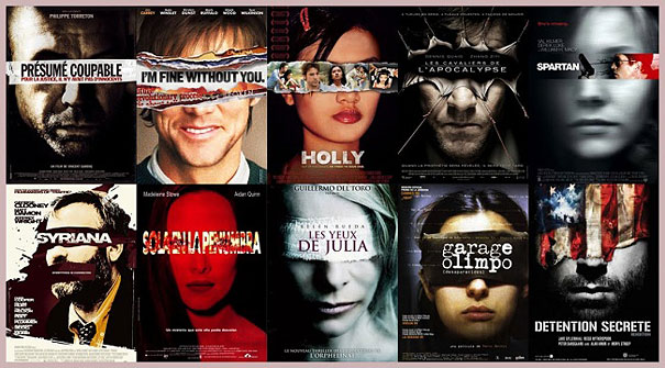
12. Justice is blind
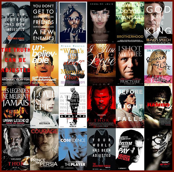
13. Big font directly in front of a face
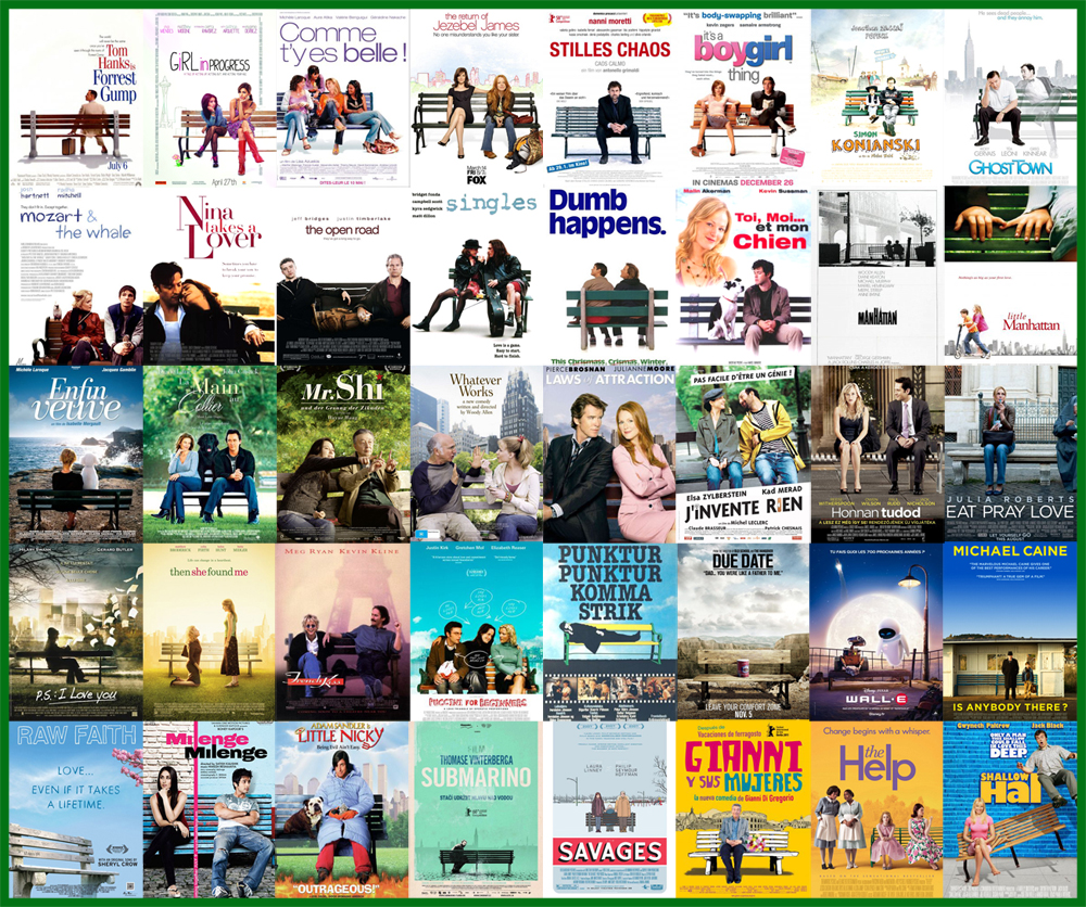
14. Benches
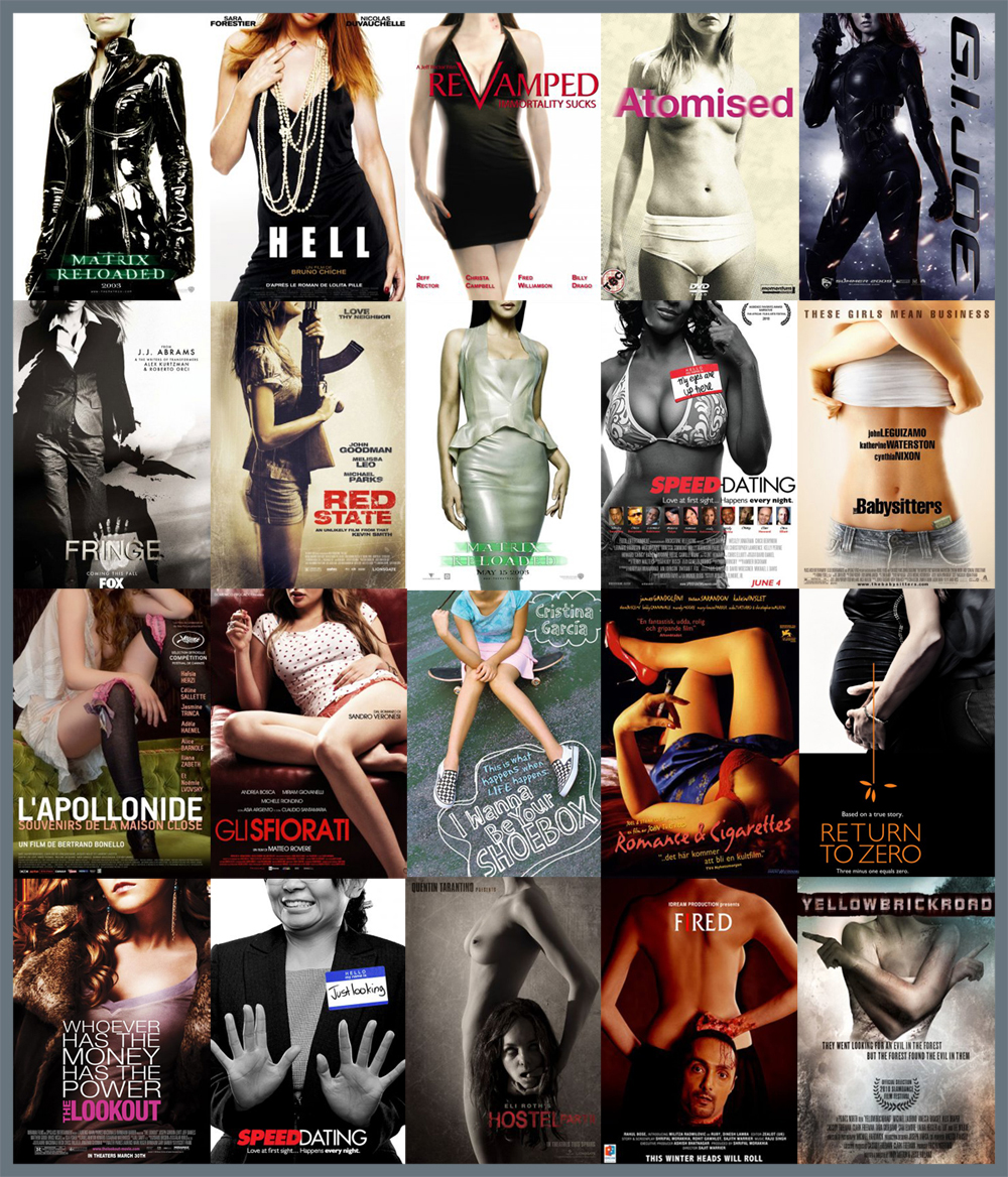
15. The headless woman

